


Dia de los Deftones is an annual music & culture festival hosted and curated by Northern California alternative metal pioneers Deftones. Every November the ’Tones bring together a handpicked lineup of bands, fine artists, and food & drink vendors for a weekend of celebration fans look forward to all year, as this is often one of the few times Deftones performs between album cycles. Since the festival’s inception, the organizers have retained most of the same creative personnel, and I decided to explore some new directions the festival could take to refresh its brand.
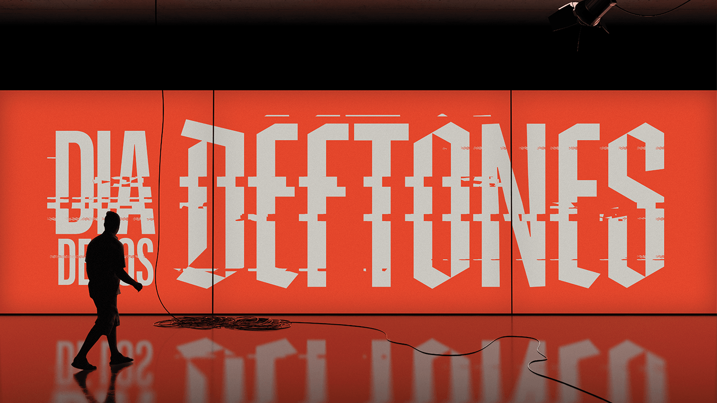
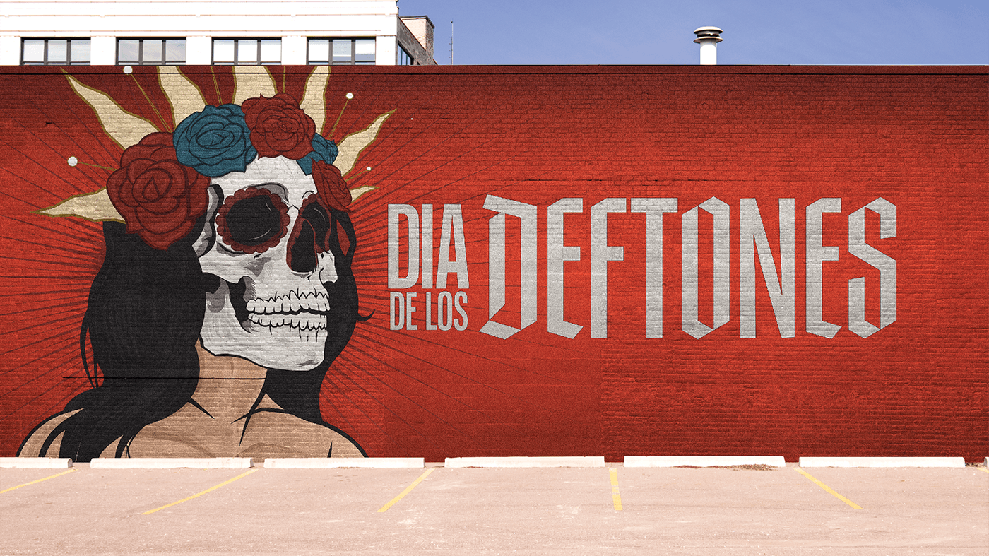
The primary objective was to craft a visual identity that was cleaner, more refined, and modernized to draw a parallel between the festival’s new look and the Deftones’ sonic evolution over the past few years. This could be easily achieved by reigning in the color palette to a few striking hues evocative of the intensity of the band’s live performances and recorded catalog.
A simplified, tighter wordmark also allows new opportunities for exploration with how to use this crucial piece of the festival’s visual brand in a wide range of contexts and applications. Introducing a noticeable degree of contrast between a sans serif typeface flowing into a modernized blackletter look gives the new wordmark a sense of motion that serves as a device to illustrate the spirit of revitalization at the heart of this passion project.


Logo / Illustration / Merchandise Design / Art Direction: Garrett Sartor
Chino Moreno Photo: Tojo Andrianarivo
Clams Casino Photo: Red Bull Music Academy
Deftones Band Photo: 13th Witness
Staff Badge Photo: Italo Melo


